Project Background
“Growing numbers of youths are heading towards adulthood without drinking at all, let alone binge drinking, and the National Drug and Alcohol Research Centre says this may be partly because teenagers now spend much more of their social time on the Internet.” — Brad Crouch, Medical Reporter | The Advertiser
Alcohol is the second largest contributor to substance-related abuse in Australia. In 2008, the Australian Government funded the National Binge Drinking Strategy where the ‘Don’t turn a night out into a nightmare’ campaign was first launched in result. Subsequent to the 2008 campaign that ran until the end of January 2010, follow up campaigns were introduced. According to the National Drug Strategy Household Survey, in 2010 (via Australian Drug Foundation, 2011):
- 87.9% of Australians aged over 14 years had drunk alcohol at some stage in their life
- The average age at which Australians first tried alcohol was 17
- Among 12-year olds, around 49% of boys and 38% of girls admitted they had consumed alcohol at some stage (ABC News, 2013)
- Among 17-year olds, it was 89% of boys and 90% of girls (ABC News, 2013)
Contemporary media is changing the way we interact with people and our surrounding environment. Studies show that teenagers today are drinking less, and even opting out from drinking at all, and this may well be a result of the influence of the time spent on the Internet. It was speculated that the age group’s love for the Internet such as, social media and online games, is taking up so much of their time, and in result, not enough time left to find themselves in drinking situations.
Another reason for the decline in teenage drinking, as pointed out in this article, is a theorised explanation of the immigration of youths from different cultures where which drinking is uncommon. “The shift in drinking behaviour is likely the result of broad cultural factors,” Dr Livingston said.
There are many factors that lead to teenage drinking. If you ask a teenager why they drink, responses vary from (via Lohmann, 2013):
- “I was bored.”
- “Everyone else does it.”
- “I like how it makes me feel.”
- “People like me when I drink because I act different.”
- “I just wanted to see what it would make me feel like.”
- “My parents do it so it must not be a big deal.”
- “It helps me escape reality.”
Excessive consumption of alcohol can lead to short-term and long-term effects, ranging from immediate harm such as injuries and accidents, to chronic harm. For teenage girls especially, when intoxicated, they are more likely to indulge in risky behaviour such as unsafe or unwanted sex, which can then lead to teenage pregnancy.
Campaign Strategies
Print vs. Online
Instead of using print media, the focus of the distribution of the campaign will be through online platforms. Not only is this a sustainable strategy, it also addresses the target end user and how they will interact with the campaign. Posters would be irrelevant in a sense that most teenagers would not want to be caught looking at a poster on anti-binge drinking as chances of being stereotyped by peers and society on a whole, that she is an individual with a drinking problem.
Through an online-based strategy, teenagers are able to view the campaign in the comfort of their own homes and in the privacy of their own rooms. As pointed out above as well, teenagers are spending more of their social time on the Internet. These social media platforms will communicate with our target audience by providing information about the campaign such as advice on drinking responsibly and how a night out is always better when you’re in control, and helpful contacts. All of this will then be tied together with various Social Events – using social media to inform audiences of upcoming social events and where to find us, as well as photographs of our social events.
Project Aims & Objectives
- To create an prevention campaign for teenage girls between the ages of 13 and 17 years old who are actively involved in binge drinking.
- To promote safety awareness amongst these teenage girls, like making bad decisions that leave them vulnerable to dangers like date rape.
- To then educate these teenage girls in the risks involved with excessive drinking, risks involving an unstable mindset, and wilfully agreeing to unsafe or unwanted sex, even if it was not their intention.
- To encourage them to make the right decision when on a night out with friends, to stay safe, and to stay in control.
- To provide guidance to these teenage girls through Raise Foundation’s mentoring program, allowing for them to feel supported through tough times, especially when dealing with alcohol abuse and sexual health.
Conceptual Framework
The concept for the campaign is based on the ideas of Proverbs, a campaign that contains wisdom, truth, morals, and is memorable so that it will be spoken about amongst teenagers for a while (making the campaign go viral over the Internet i.e. #yolo). The campaign will not make the decision for them, but will provide advice between what is right and what is wrong. Approaching the campaign this way will allow teenagers to think and reflect on their habits, and are eventually able make to their own decision. Imposing the right way onto them may cause a ‘who are you to tell me what to do’ attitude as some teenagers do not like being told what to do. Hopefully the campaign will then encourage young teenagers to postpone the age at which they first start to consume alcohol, and for those teenagers who are already consuming alcohol, to promote responsible drinking.
Environment/Spatial Design Aspect
Social Events
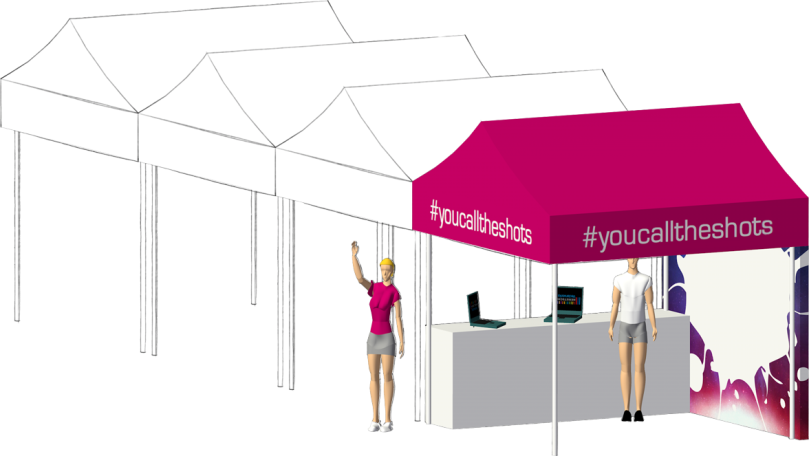
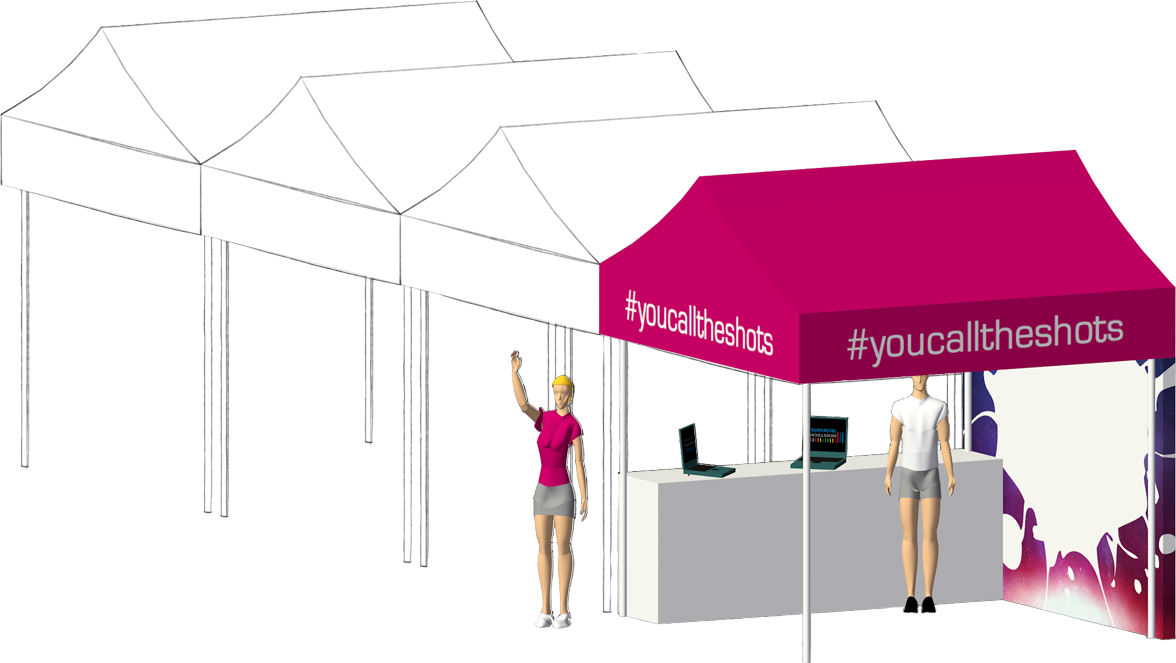
Apart from the campaign launch party, #youcalltheshots will be making appearances at various social events. An information booth will be set up so that event/festival-goers will be able to know more about the campaign and participate in activities such as carnival-themed games, giant twister, obstacle course, trampoline bungee, photobooth, etc.
Where the booth is located is an important factor to consider. As you can see, by having a corner booth, it allows one of the sides to be open, therefore allowing the ease of flow for visitors for easy access and making the booth more spacious.
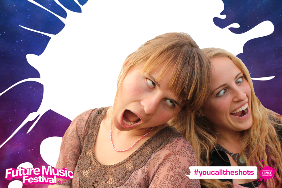
Photo Booth
Everyone, especially teenagers, love to take photos, or get their pictures taken. There is a growing culture of this idea of needing to take photographs and uploading them to social networking sites as a way of proving to others that you were there at that particular event, at that particular day/time – as the lingo goes, “pics or it didn’t happen”. So what better way to grab the attention of those festival-goers into our photo booth?
Graphic Design Aspect
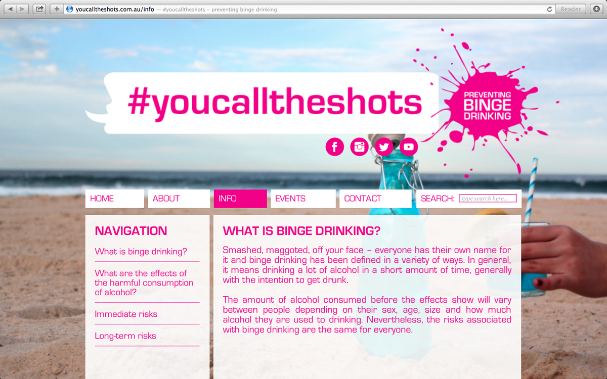
Branding & Logo

The final logo does not have a black outline around the speech bubble, this is just to make clear the shape of the speech bubble that is coloured white.
Through the development stage, I have changed and refined the branding and logo for this campaign multiple times, not just in terms of design, but also in terms of choosing the right colour scheme for the whole campaign. I ended up choosing the colour pink as it stereotypically represents the female gender, teenage girls between the ages of 13 and 17.
I came up with a variety of tag lines to piece together the message of the whole campaign. I then took my tag lines and did a small survey to see which got more of a reaction, and it appeared that the tag line ‘You Call The Shots’ appealed more towards the targeted audience as it is a clever play on words. ‘You Call The Shots’ is an idiom which, figuratively speaking means, to decide on the course of action; to be in charge; to make the decisions; to decide what is to be done. ‘Shots’ also referred to a series of alcoholic beverages served in succession, usually served in small amounts in ‘shot’ glasses. So by you calling the shots, you get to decide for yourself whether you should take the shot or not.
Besides the colour and messaging, the design of the logo is based on a speech bubble which ties in with the concept of ‘advice giving’. If you can see it, the left side of the speech bubble is a profile of a person’s face, as if speaking out into the speech bubble. The person is also smiling, indicating that they a putting forth a positive message unlike the demonising of people and negative connotations associated with binge drinking in previous campaigns.
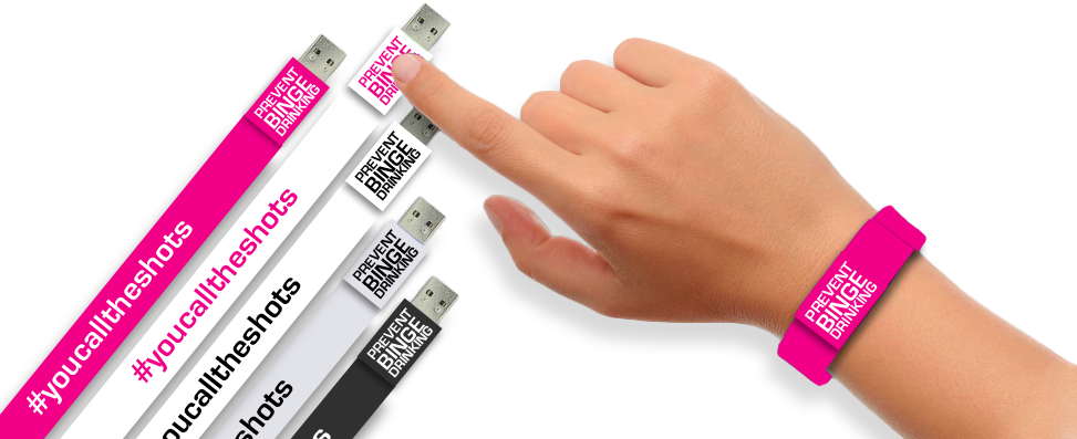
USB Wristbands & Digital Cards

Besides getting your photograph taken at the event, we will also be giving out free USB wristbands, which is essentially the digital version of a flyer or information booklet. This way, it will be easier for visitors to hold on to, or wear, while enjoying the festival and will definitely keep them for later use instead of throwing them out.
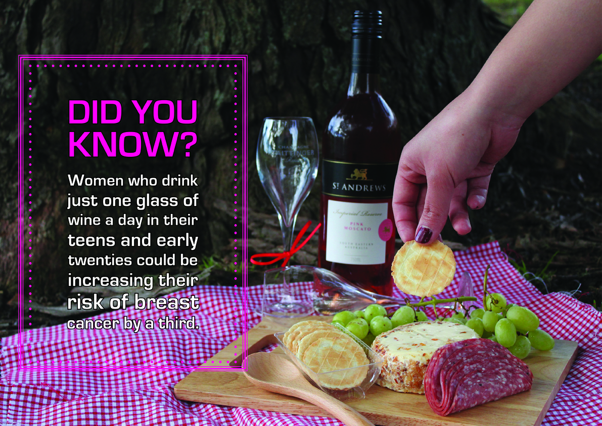
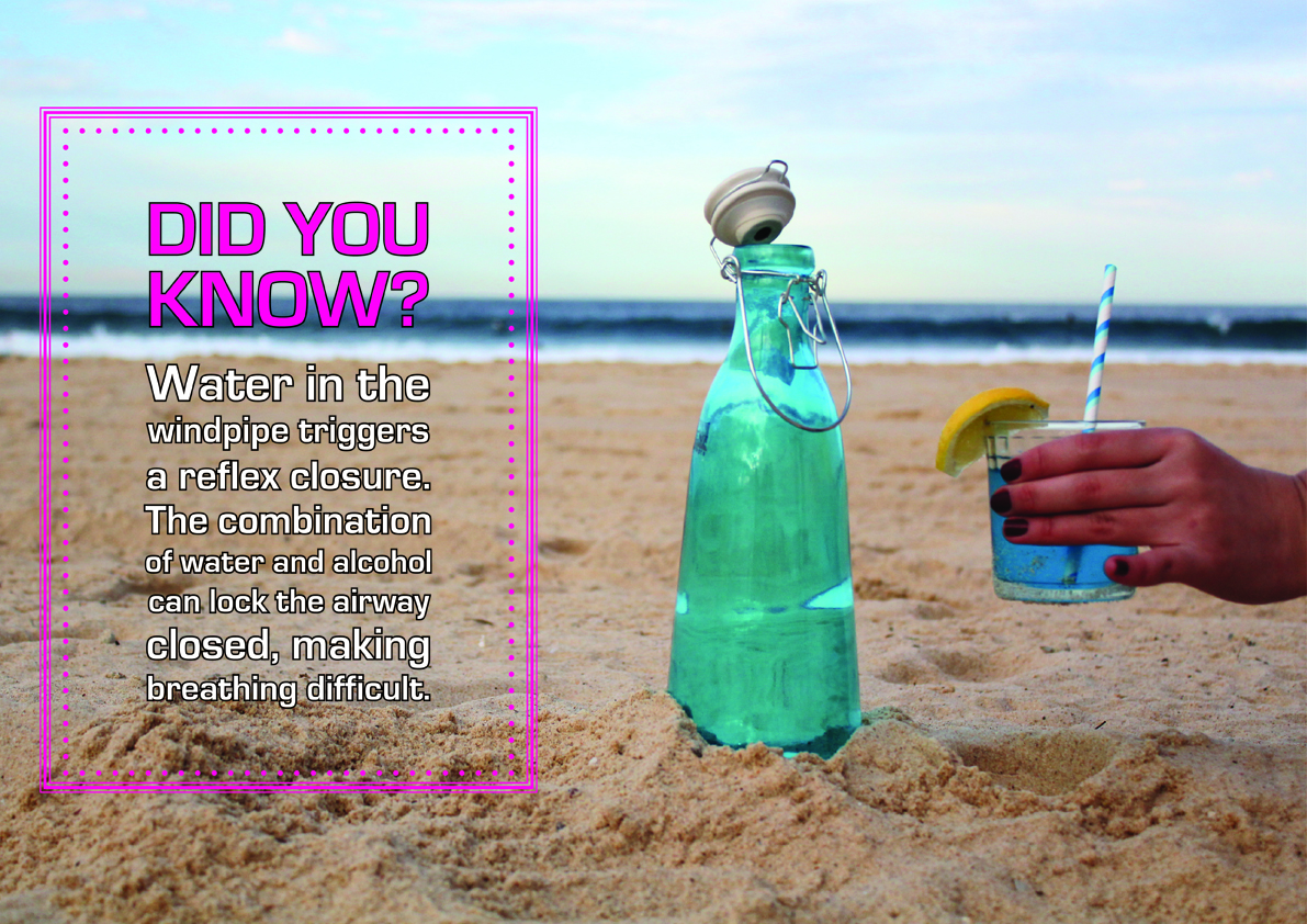
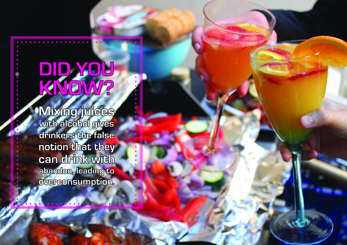
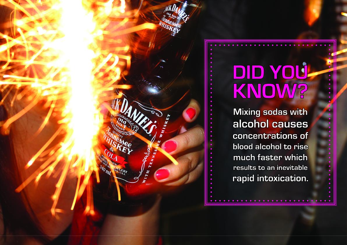
The USB wristbands are also personalised in a way that the photographs taken at the booth will be automatically uploaded into the wristbands. Visitors can then upload the photographs onto social media sites or print it out themselves. Besides the photographs, the USB wristbands will also contain posters/postcards with ‘Did You Know’ alcohol facts that they can later print as well if they want to. There is also a card with all the social media links for those who want to follow the campaign online.
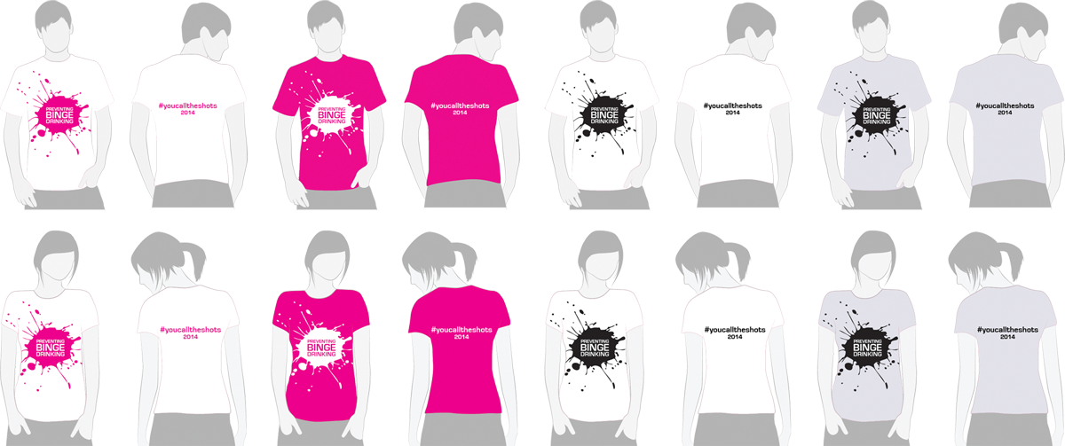
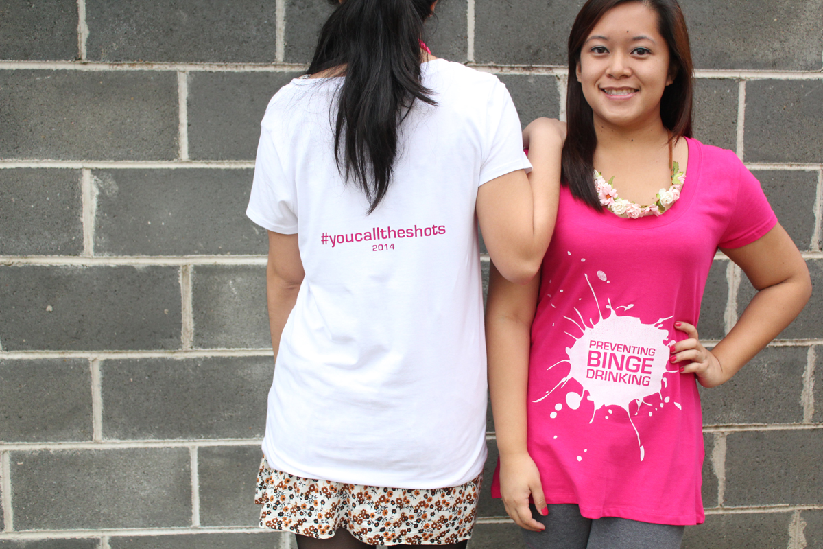
T-Shirts
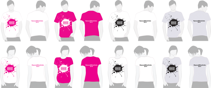
T-shirts are also available for purchase at these events. I have also added two extra colours besides the colour theme of the campaign. The black ink shirts are essentially for those (particularly targeted towards guys), who do not want to wear the colour pink.
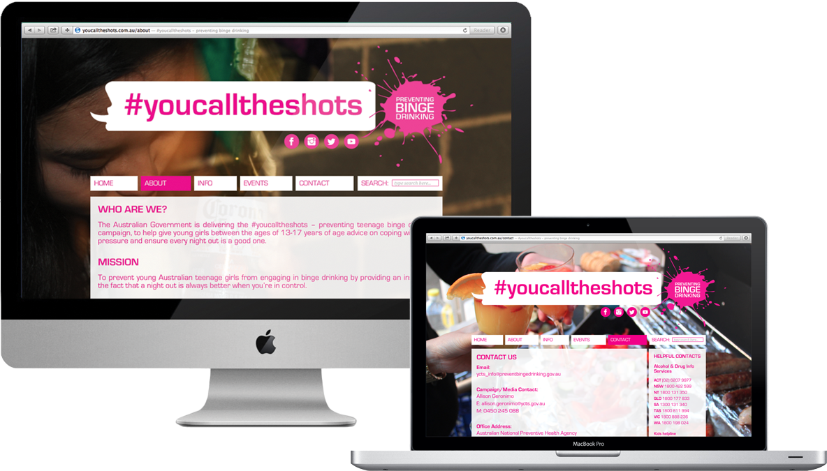
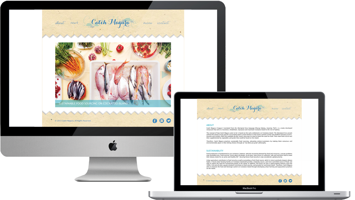
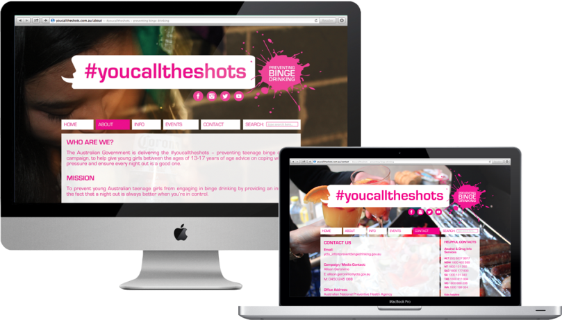
Website
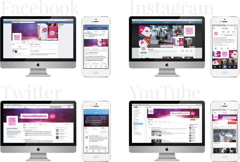
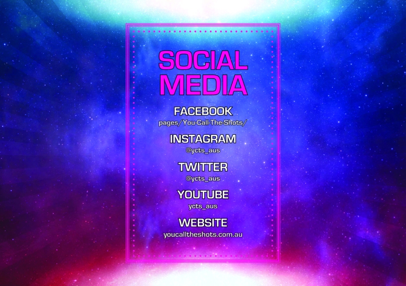
Social Media

Public Prank Video
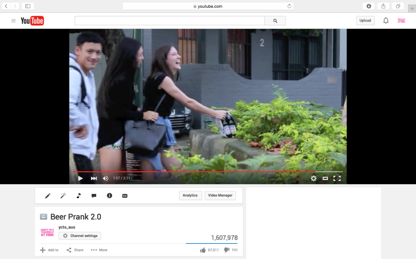
The idea behind this video campaign was inspired by movie producers merging movie trailers with public pranks to advertise their upcoming movie i.e. the Telekinetic Coffee Shop prank used to promote the movie Carrie, it sparked a lot of views and went viral in an instant.
For this campaign, I wanted to go along the lines of creating a public prank to promote the campaign by making the video go viral. The concept of the prank is as follows:
- A new, unopened, chilled bottle of beer glued to the walkway as part of a public prank.
- A person walks by and spots the bottle of beer.
- Curious, they bend over to pick up the bottle of beer but then struggle to actually pick it up.
- The person is confused, and then maybe realising that they were just pranked.
- The person may snap a picture and upload it to Facebook, Instagram, etc. and #totallyjustgotpranked #youcalltheshots #ycts2014 #icalltheshots #alcoholfree, etc.
- The person walks away without the bottle of beer, and the tagline ‘You Call The Shots – preventing teenage binge drinking’ implying that you left the beer behind and didn’t need it after all.
For the purpose of this project, the prank will be partly scripted and acted out by my peers – they will be told what to do, like walk towards the beverage, pick it up, and walk away, but they won’t be told that the beverage is glued to the ground or table to capture their raw reaction.
I have uploaded the videos privately on YouTube, but if you wish to watch them, click here for the first video, and here for part II (ps. I had to tell some of my peers to fake pull the beer off the ledge because it wasn’t glued on properly). Enjoy!
– Ally xx