

BRIEF
Explore the design of new typographic letterforms. Your development of a series of designs about media technologies provides you with the opportunity to consider how technological changes impact our experience of typographic design, and visually represent your experiences of radio, television, SMS, and E-mail. You will design a typeface of twenty-six letter. The typeface will convey a particular media experience, and designed with consistent proportions in line weight, cross bars, curves, counters, and endings. Take creative risks and develop your studio skills in analogue and digital technologies.
CONCEPT
The media experience that inspired the design of this font is the photo-sharing application and social networking program, Instagram. Remains is a response to how I use the application, which is to take photos of food and share what I cook, what I eat, and where I eat, daily. The approach of my typography design was to shape letterforms from elements of food. I experimented using different pasta shapes and thick liquids such as jams and sauces to create my letterforms. The design idea further developed from what I had been told by my mother as a child, to “never leave anything edible on my plate” and to “think of all the children starving in Africa.” By these words, I’ve been trained to eat everything edible on my plate as a child, only leaving behind what I cannot consume for example, bones and shells. This habit or way of eating is still in me today – I completely wipe my plate clean, and even had comments from various waiters across the cafés that I’ve been to say “well, I won’t be need to wash this plate!” Therefore the design of the letters is based on the shape of a bone from a chicken drumette. The alphabet is presented in uppercase to express importance and enforcement in a way that I have been ordered to eat a certain way. In addition, the thin lines that create the individual letters provide a sense of cleanliness, again reflecting on the idea of how I had to ‘clean’ my plate, making sure that I left nothing behind to please my mother. Also, the thin lines reflect the starving children in Africa, thin to their bones due to the lack of food.


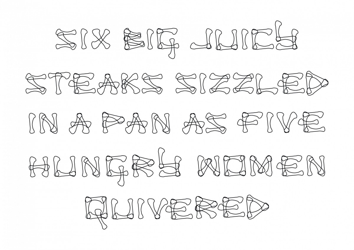
Remains (2012).
Allison Geronimo
